
ESL Speaking: Data visualisation and infographics
What's the point?
After spending hours browsing the subreddit dataisbeautiful and staring at the pages of David McCandless' 2009 book Information is Beautiful, I decided a while ago I needed to start to incorporate data visualisation into my ESL classes. Don't get me wrong, I hate graphs as much as the next humanities student but when data is displayed in a visually stimulating way I can stay focused.You might be asking, what's the point in this for an English learner? And honestly, that's a fair question. But I've taught many Academic IELTS preparation classes and this is a fun way to practise for task 1 of the written exam - which is a graph, diagram, table, map or chart interpretation.
Even for those not taking an exam, practising vocabulary associated with change and data is incredibly useful. Verbs such as 'diminish', 'increase', 'stabilise', 'decline', 'plummet', 'fluctuate', and 'vary' are becoming commonplace in our everyday vocabulary when so much of the news focuses around presenting charts related to Covid-19. Even for teen and young adult learners, data interpretation exercises provide a great way to covertly practise adverbs, e.g. 'significantly', 'steadily', 'rapidly', as well as terms used for approximations, e.g. 'around', 'almost', 'just over', 'less than'. Besides all this, it offers a great means by which to foster critical thinking.
Some examples
First, my favourite:

Source: Reddit user BoMcCready with IMDB data
I love to use these charts when discussing film genres. I make the students work in pairs to identify changes and suggest reasons for them. I've had students provide excellent suggestions for the sudden rise in documentary film popularity, the decline of musicals, and the sustained success of comedies. Students are especially good at noticing the correlation of the dates and historical context (e.g. World War 2). I have generally received positive feed-back from teens on this exercise, as they like the interpretive aspect of it on a topic most students have enough confidence in to speak at length.
On a sadder note:

Source: Information is Beautiful
This always gets young adults talking. Block out the explanatory labels before you show them in and ask students to guess what the arrows could symbolise. Bear in mind whether the holidays labelled are celebrated in your students' country.
This might not excite your average English learner, but it excites me:

Source: Reddit user xilefakamot on r/MapPorn
Hide the explanatory text from the students and see if they can guess what it represents. It's a good way to practise country names in English. Ask them if anything surprises them and what the blue represents.
Getting students to do the data viz
A survey-based activity
Have students design a small survey based on a question for their classmates, e.g.:
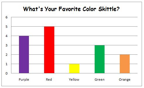
- What's your favourite colour skittle?
- What's the best ice-cream flavour?
- Which country do you think will win the football world cup?
- What's your favourite music genre?
- What time do you go to bed?
Have students mingle and ask each other the questions in English, collecting English-language answers. Then teach students to put the data into Excel or similar to produce a bar-chart or a pie-chart to display their results. Print out the charts and have each student report back to the class in English on the results of their survey, e.g. 'the most popular colour skittle in the class is...', 'fewer people like...', etc. Why not integrate a maths skill into an English class? It's also an excellent way to practise numbers and question formulation with lower-level learners.
Word clouds
This is just a nice way to show an older class the need to diversify their vocabulary. Have the students put the text of one of their essays into a 'word cloud' generator. For example, here is the text of an essay I wrote during high school Spanish classes. You can see that some words are very large, i.e. I used them frequently. If similarly large words come up for students (and I don't mean 'the', and 'and' - you can delete those. I'm talking repetitive use of 'good'), then have the students brainstorm some synonyms. This will help them to recognise the need to have a wide range of vocabulary. All through data!

I keep my favourite ESL-friendly data visualisation examples on my pinterest board. You can check that out for more inspiration, as well as these other sources:
- Delayed Gratification
- Knowledge is Beautiful book by McCandless
- r/MapPorn
- Tableau Public gallery
Please get in touch if you have anymore ideas for data use in the classroom. I don't believe that the maths and art classrooms should have a monopoly on these wacky infographics! Thanks for reading, N.


Comments
Post a Comment